
Overview:
About
For this project, I was tasked with re-designing Swipe, dating feature that is a part of The Meet Group’s host app, MeetMe.
Goal
Modernize the overall look and feel of the dating feature
Improve the usability of the feature to help users connect with one another
Increase Daily Active Users
Monetize the feature
Challenges
Incorporate and modify where necessary the newly redesigned user profile
Create a system and design in a modular way that will be easy to implement Swipe into other host apps
Adjust the design in the midst of host app redesigns
Product
Dating
Role
Product / Branding
Current:
My first step in this redesign was analyzing our current dating feature and seeing what features we currently offer, identify pain points, and what we can approve on.
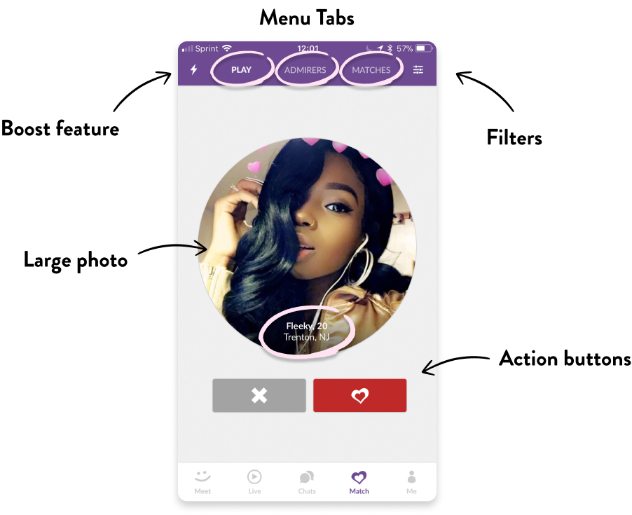
Menu Tabs
We have three menu tabs, Play, Admirers, and Matches.
Play is the main feature where users take action on users.
Admirers are users that “Liked” the user.
And Matches are users that have liked the user and vice versa.
The text tabs feel tight and I have concerns about localization.
Boost
A “boosting” feature that promotes the user in the stack.
Filters
A filter icon.
The filter and boost icon feel crowded amongst the Text menu tabs.
Photo
There is a large circular photo that takes up the majority of the screen. The name, age, and location is also present, but there is nothing else on this screen that tells the user more about this potential match.
FABs
There are two FABs, one for dismissing the user and the other for liking.

Reinforce the company mission statement of
“Meeting the universal need for human connection”
VISION
Research
To kick off the project, I researched our competitor apps. I primarily focused on Tinder, Hinge, and Bumble because they cater to a similarly aged Millennial audience like us. I also looked at Badoo, eHarmony, Match, OkCupid, and Plenty of Fish for further inspiration and to identify what sets them apart from the other. During my research, these are things I focused on :
Overall layout
What sort of actions can a user take from the ‘Play’ screen
What happens after a user “matches” with another user
What incentivizes the user to keep using the app

Play
The “play” screen of most dating apps is pretty consistent :
Swipe/Tap “Yes” to match with someone
Swipe/Tap “No” to dismiss
Adjust filters
View the profile
Some apps even had what I would call “bonus” features :
Undo-ing a swipe on a user
Boosting themselves to increase the likelihood of their profile being viewed
Active online status notification
Highlighting if the current profile liked them back
Matches & Likes
The Matches & Likes sections shared many similarities. Both hide the users that have taken any sort of action on the user behind a paywall, pushing some sort of monthly subscription or even a one time fee to view users for a day.
Once the list was revealed, users can take several actions:
View profile
Swipe “Yes” or “No” on a user
In some cases, directly message a user
New Look
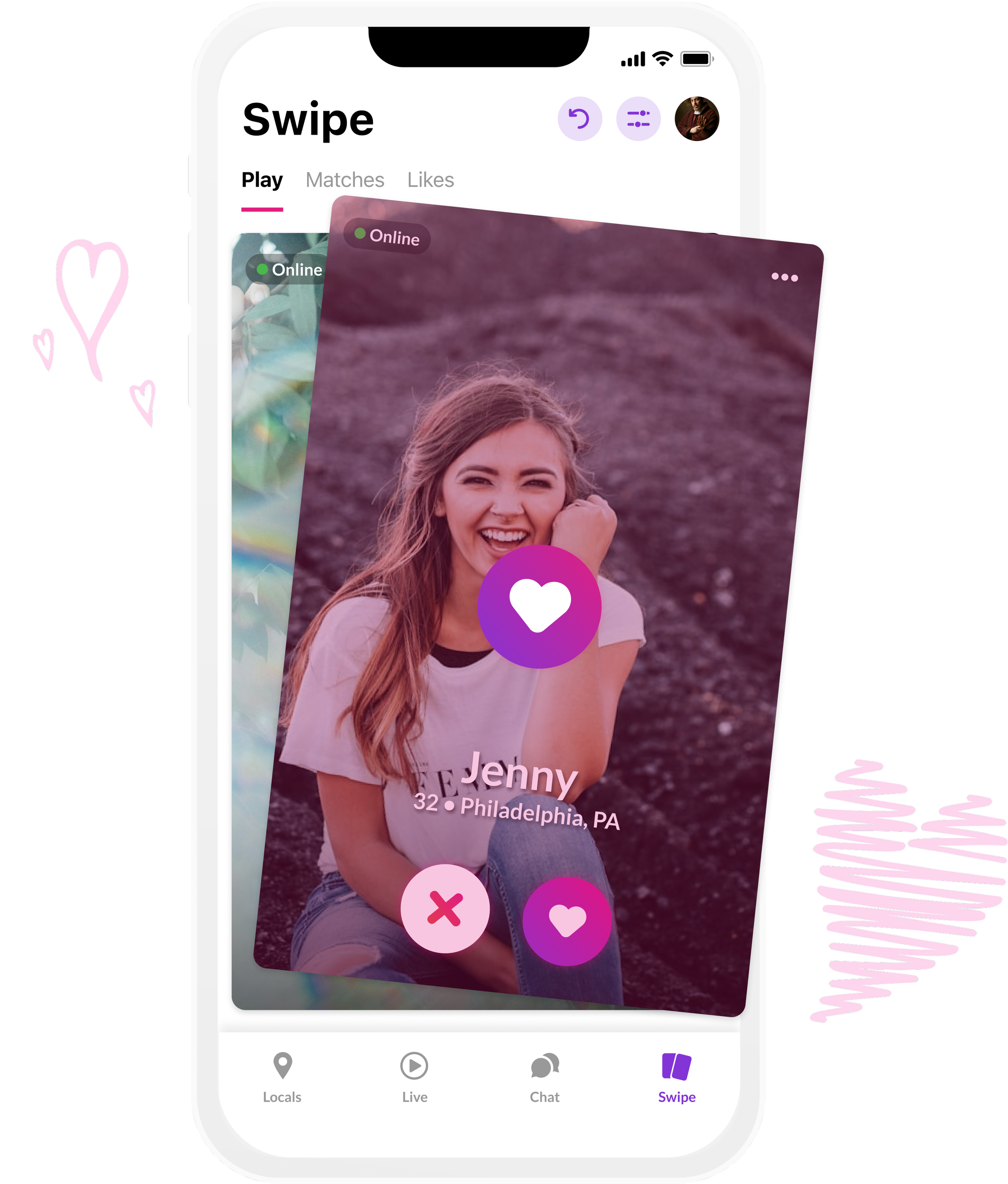
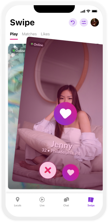
Before working on any designs, I’ve had several meetings with our product manager to go over what our core features will be to set up a foundation for any future features. We chose to go with the standard dating app swiping mechanic. We re-used and adjusted the newly revamped profile (created by my coworker Meg Graf) to fit this swiping style. Majority of the focus is on the user’s hero photo, name, age, location and new FABs to let the user accept or decline the profile. We simplified the over all UI with a cleaner white background and expanded the tabbed menu options.
With the new UI came a few new additions:
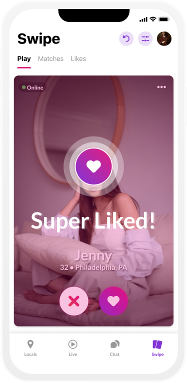
Super Liked - this allows users to express greater interest in another user
“Liked you” pill - a pill callout letting the user know another user has liked their profile
Mini live streaming preview - if the current profile is live streaming, the user is able to join the live stream from the Swipe game
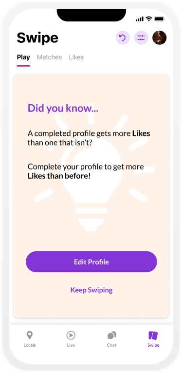
Tip Cards - Cards in the stack that remind users to verify their accounts, complete their profile for better matches, if they have exhausted their search results, and if they are out of swipes

New Swipe UI

Live Stream Preview

Swiping No
Tip Card
Swiping Yes

Verify Account Reminder
Super Liked

Exhausted Matches

“Liked You” pill

Exhausted Swipes
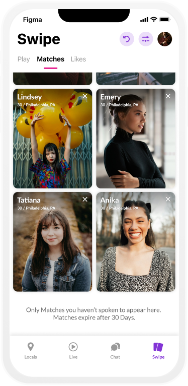
Matches & Likes
The Matches and Likes screens have been updated to follow a new grid portrait layout. Both layouts now include an online indicator and the Matches screen now has an expiration pill with a countdown over profiles that are about to disappear.

Matches Screen with Chats

Hidden Likes
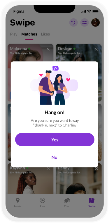
Removing a Match

Login Streak - Day 1
Sending Like from Likes Tab

Match with expiration pill

Login Streak - Day 2
Rejecting a User
Disclaimer
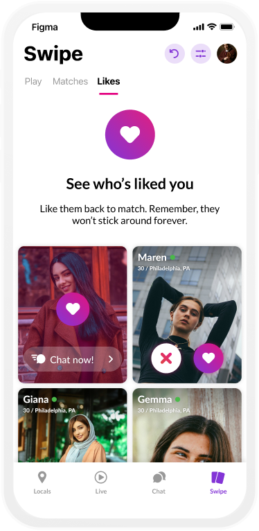
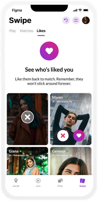
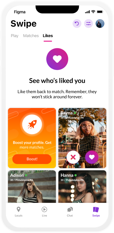
The Likes screen received a bigger redesign with the inclusion of new features.
Users can view their likes, tap ‘yes’, and tap ‘no’ on the profiles
If a user taps ‘yes’ on a profile, they will be prompted with a “chat now” CTA to get a conversation started
Unlock Likes - Once the initial core redesign was finished and launched, we next focused on features to further improve the experience and incentivize users to come back to the app. Most dating app competitors lock Likes behind a paywall or make users subscribe to view them. We decided to take a different approach by allowing users to unlock their likes via login streaks. The user will have to login 3 consecutive days in a row to be able to view their Likes tab whenever they like. However, if the user has not logged in several days, they would be locked out of the Likes page and the login streak would be reset

Login Streak Complete

New Likes pill
Empty State

Likes unlocked
Empty State
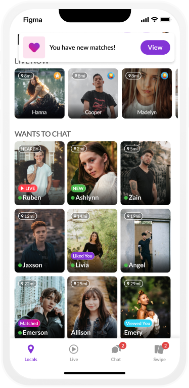
Improved Notifications & Entry Points
We also added improved notifications to let the user know when they received a new like or match.

User Match
Generic New Matches

Generic New Likes

Blurred New Likes

New Likes Pop-Up
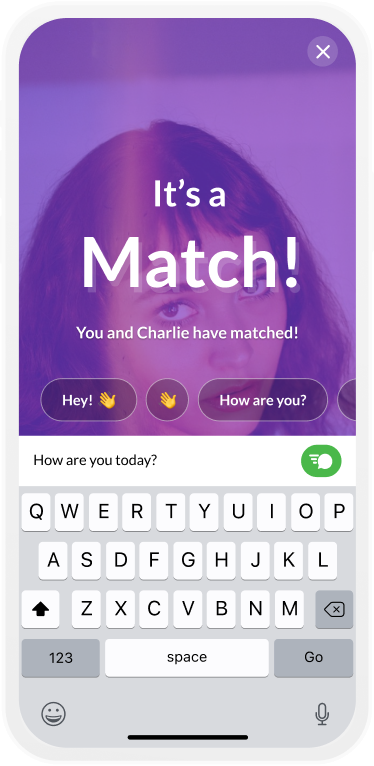
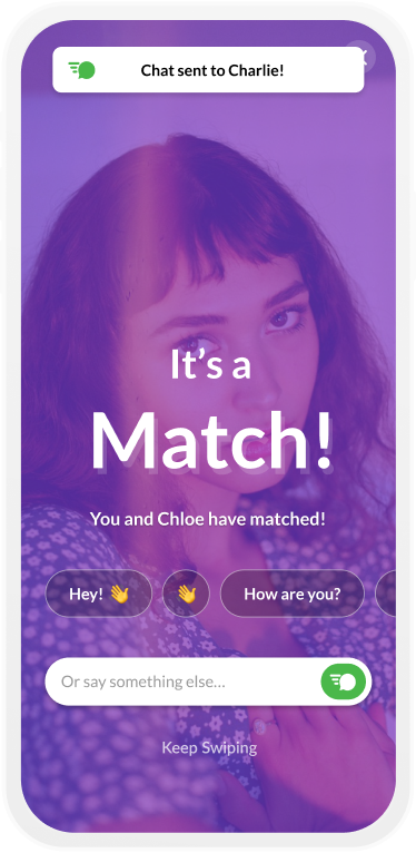
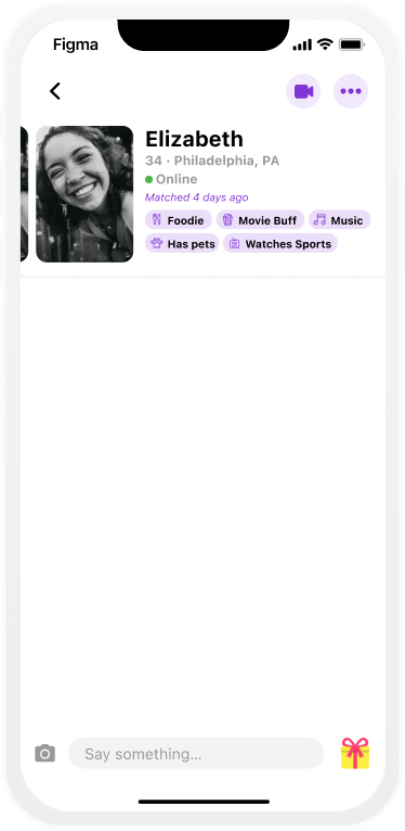
Matching
For the Match screen, I designed a full screen photo the matching user with several actions for the user to take. We wanted to make it easier to send the first message, so I designed a carousel of chat prompts that can make making the first move easier. The user is also able to write out their own message or they can message later and continue swiping.

It’s a Match!
Custom Chat input
Chat sent toast
Additional Entry Points
I also added addition entry points and callouts throughout the rest of the app including the chat inbox, messages, and requests.
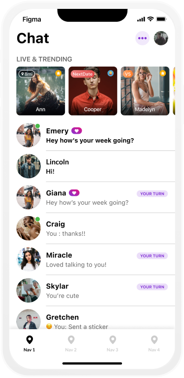
Match heart pill in Chat
Match callout in Messages
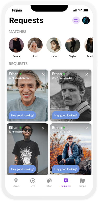
Matches marquee in Request inbox
New Features
Boost
Boosting allows users to increase the likelihood of their profile surfacing for other users. For a limited time, their profile will be prioritized over other users. Users are able to check how much time is left in their boost and are able to extend their duration at any time. Boosts are offered in duration options, 1, 6, and 24 hours. Once the boost is finished, the user will be able to view their results. I also included callouts throughout the feature to let users know which users they were matched with while their boost was active.

Boost icon in Header
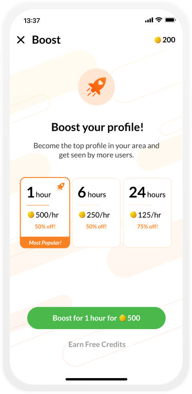
Boost purchase screen
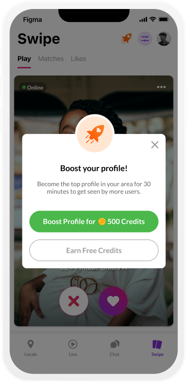
Boost your Profile modal

Boost activated toast

Boost upsell tip card
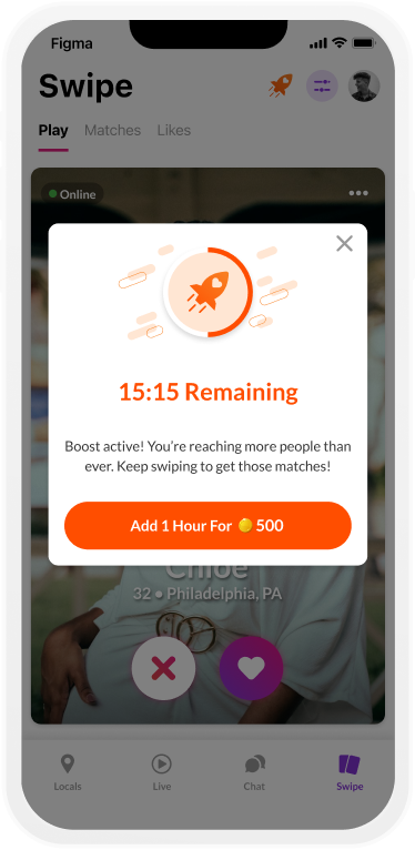
Boost status modal

Boost upsell in Likes

Boost results card
Boost upsell in Matches

Boost user Like
Reminders
To further incentivize users to come back to the Swipe game and make the first move, I also designed notification screens to remind users of new matches, matches that are about to expire, and to encourage users to send the first message.
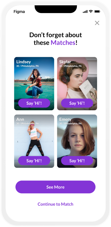
Matches Reminder

Chat sent
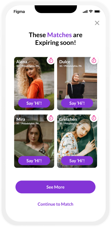
Expiring Matches Reminder
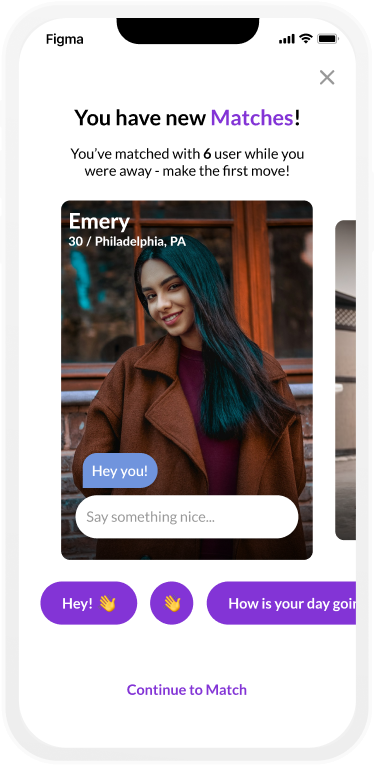
New Matches Reminder
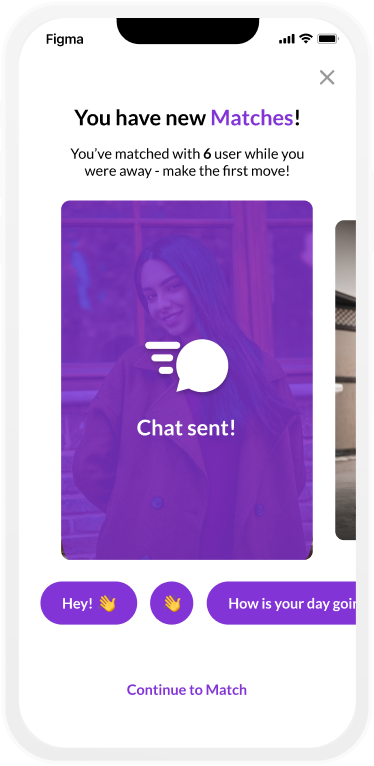
Chat sent
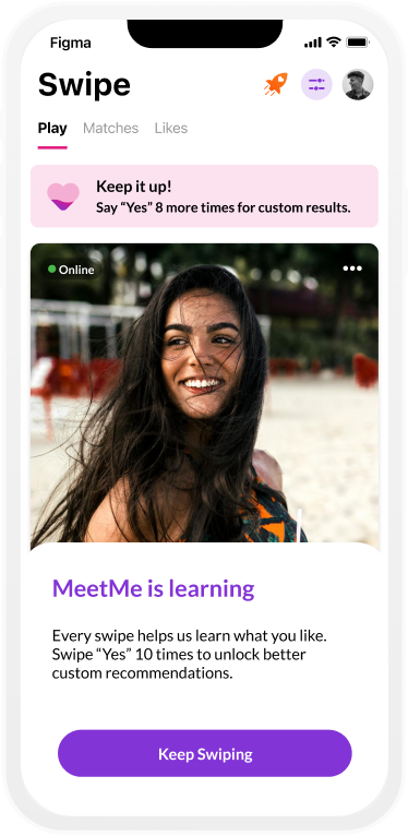
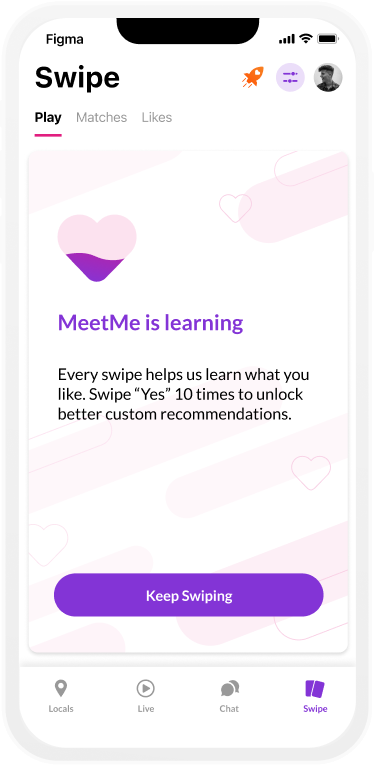
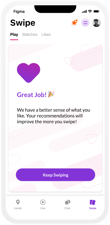
Swipe is Learning
To better increase our users chances of matching with a compatible match, we began using machine learning to ‘learn’ more about our users and their swiping habits. Once the user has swiped ‘yes’ on 10 users, we begin to show profiles that are most compatible with the user.

Learning module
Details Drawer
Learning tip card progress
Learning tip card complete
Requests in Swipe
To better make the Swipe feature feel more coherent with the rest of the app and its features, we decided to start surfacing chat messages on Swipe profiles from Requests. These appear as chat bubbles over the profile and over the Match screen.

Chat Request on Profile

Like on Profile

Chat Request on Match screen
Over 2.5 Billion Swipes since 2022
HOW DID WE DO?
Results
Since launching the new redesign of the Swipe game...
Over 2.5 Billion Swipes since 2022
1 Billion ‘yes’ votes
32 million matches
143% increase in swipes per day
125% increase in yes swipes per day
550% increase matches per day
165% matches per swiper
75% day 7 return rate + 62% Day 1 Return rate