

Overview:
About
For this project, I was tasked with refreshing our existing Credit Recharge menu that is a part of our Live Streaming service.
Goal
Modernize the overall look and feel of the credit recharge menu
Experiment with alternative headers
Experiment with different offer types and upsells to increase revenue
Challenges
The menu is one of the main entry points to recharge credits
Users may express hesitation to changes
Product
Monetization
Role
Product / Branding
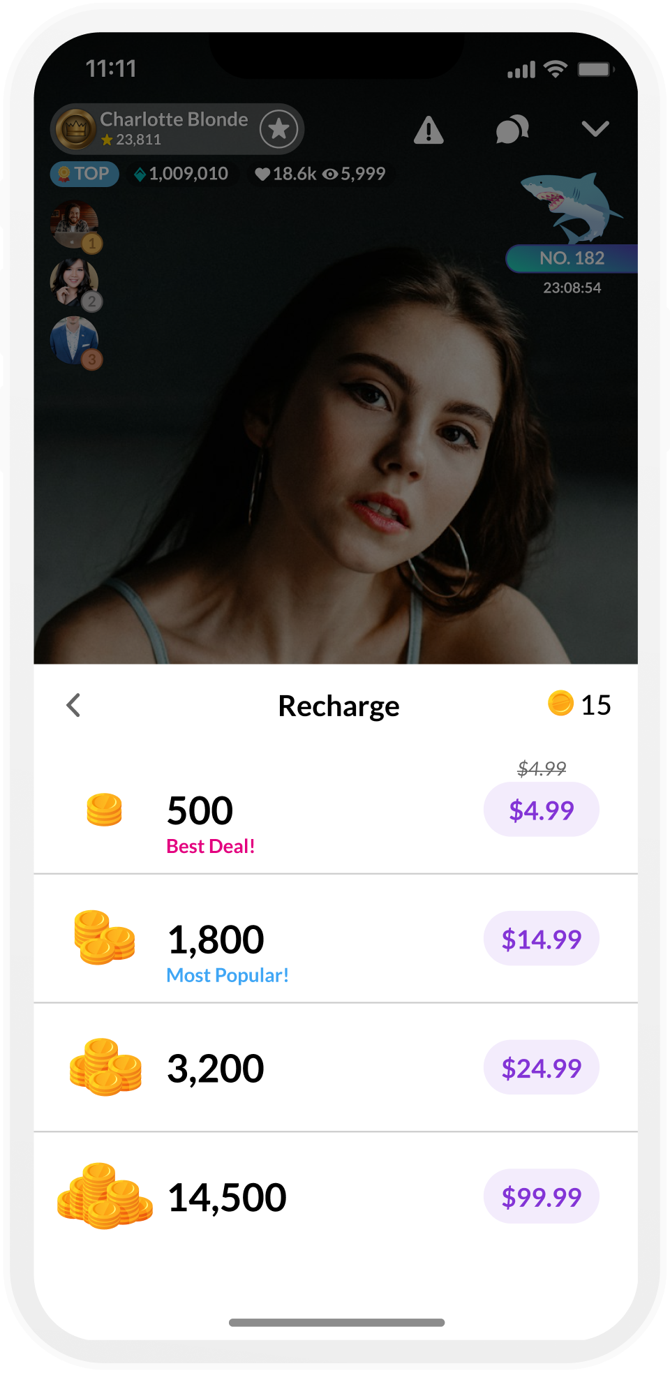
Current:
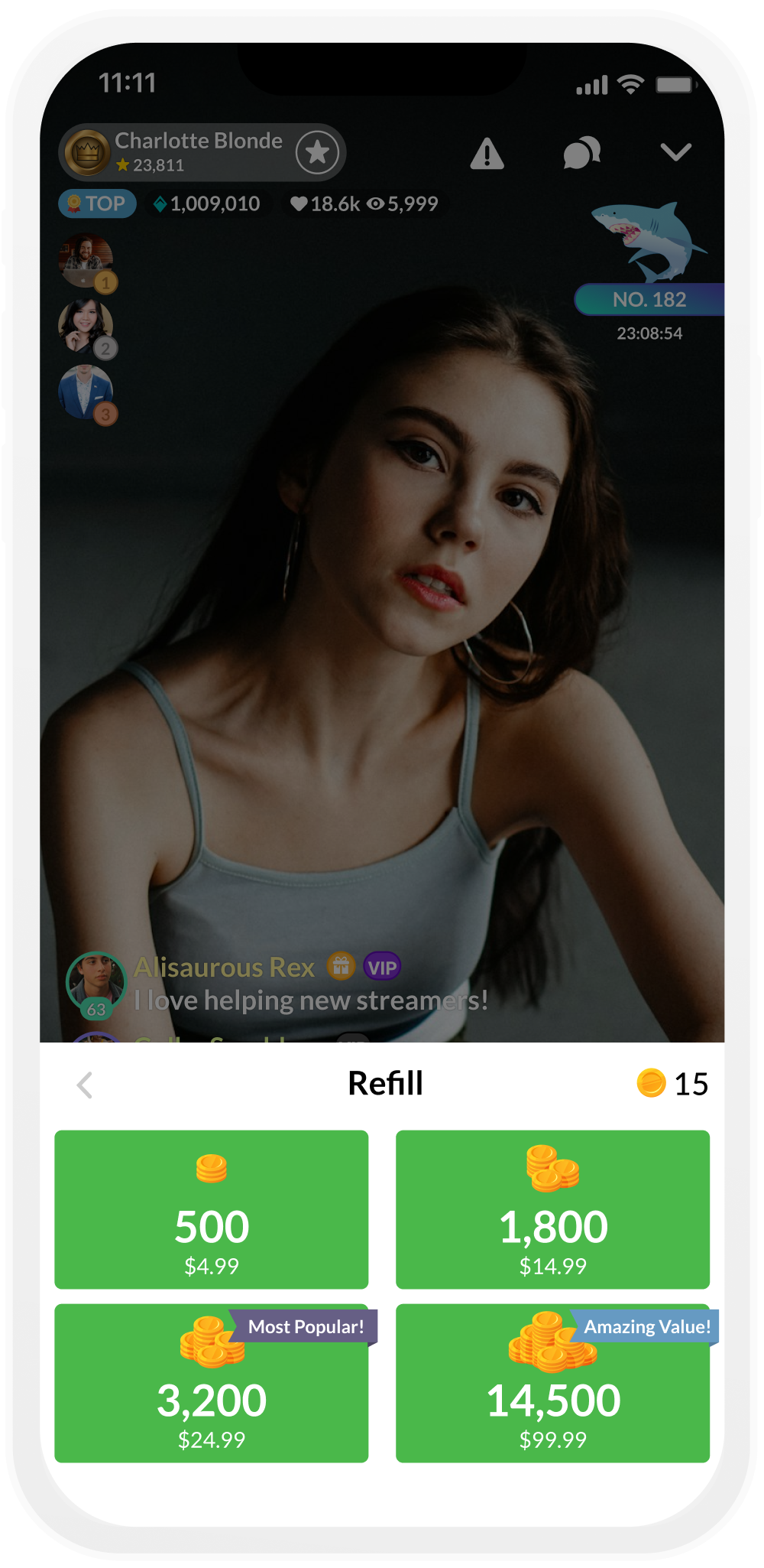
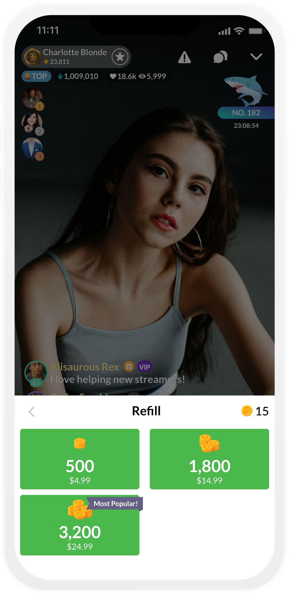
Here is our current Credit Recharge menu.
Key things to note:
At it’s current design, the menu can only support four packages at a time. It is possible to paginate the screen to view more but if there is any less than four packages available, the extra white space is visual unappealing and gives off the sense that something is missing
The packages are colored a bright green, making it difficult to layer over any other colors and the existing upsell banners look dull
The long rectangular shape and stacked elements makes it difficult to include any other information like potential offers
Compared to the rest of the live streaming feature, this menu looks the most dated
List
Pros
Flexible design
More room to fit more information, allows for better stacking and layering of elements
Spacious, extra white space helps the rows feel less crammed and easier to parse hierarchy of information presented
Can fit more package options by increasing height of recharge menu container
Cons
New design layout, may make returning customers hesitant to use
After doing some research and discussing this project further with the Product Manager, we decided to experiment with two layouts : a grid view and a list view. In my research of competitor apps, I found that both the grid and list views were commonly used. I looked at around 8 competitor apps and the designs were split down the middle between grid and list layouts. However there were still some concerns to consider.
Grid
Pros
The current and most familiar design
Can be compact, 4 vs 6 grid
Cons
Limited confined space
Width of the containers greatly relies on screen size. Some information may need to be truncated or will be cut off
Uneven visual balancing between graphic. credit amount, cost, and upsells
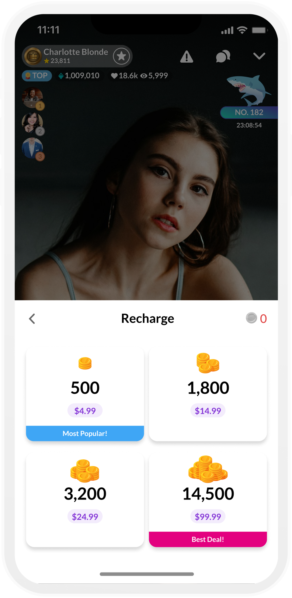
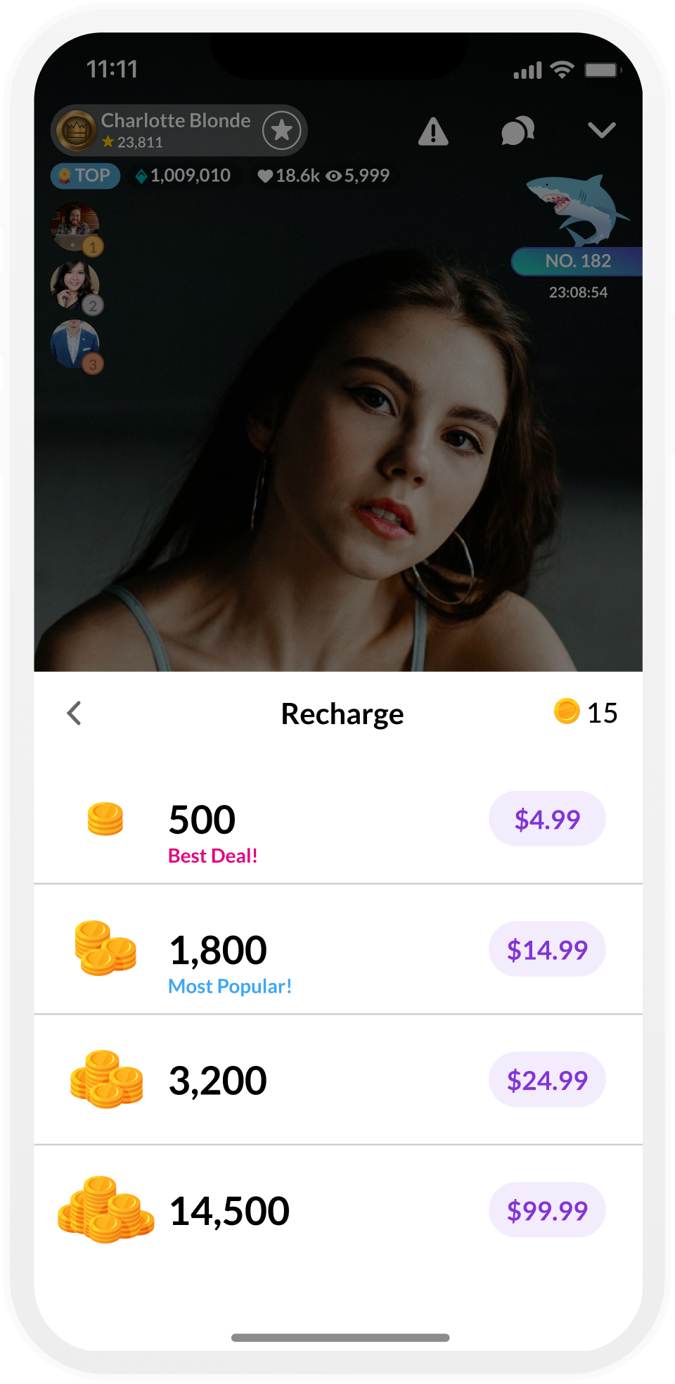
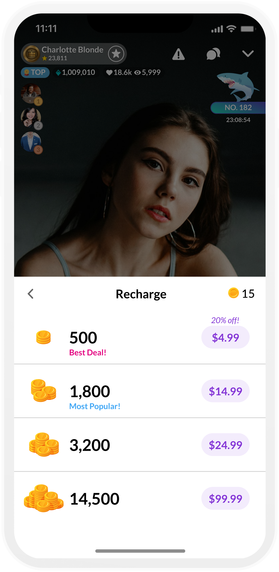
Redesign
After several iterations, I had a final approved redesign of the recharge menu. I revamped the grid layout and created a new list layout. For the grid, I removed the green background and replaced it with a white background. This allows for more color options and makes the new credit icons I made pop more. I added a drop shadow to help the packages stand out more on the white background. I also removed the corner banner style upsells for “Most Popular” and “Best Deal” and redesigned them into a sticky banner on the packages. The previous banners made the packages look misaligned and overlapped on smaller devices. Having it be more stacked and inline with the rest of the content. The list view was much easier to design and stack the elements. There is a clear hierarchy and I was able to put more emphasis in the price pill as opposed to the grid view.
With the new design finished, I was ready to start adding the different credit offers we will be experimenting with.


NEW CREDIT ICONS


+N Credit Bonus
A flat numerical value addition to the credit amount in a given package


Strikethrough Pricing
This offer crosses out the previous price to further emphasize the new price

Lightning Offer
This offer is a limited timed lightning deal. There is a strikethrough through the previous cost and a countdown timer.
+N% Credit Bonus
A percentage based numerical value addition to the credit amount

A percentage discount on the price of a package


N% Off Price

Coupons
This offer allows users to use a coupon to apply a varying percentage based discount off of the package price


Results
Converted 4.50% more users to purchase target packages on MeetMe
~8% conversion rate on TaggedImproved Average Order Value by ~14% on MeetMe and 6% on Tagged
Increased Cumulative Revenue by 10.50% on MeetMe and ~9% on Tagged
AB tests results showed a positive % change in favor of renaming to “Recharge” for a total revenue & ARPPU of 7.5% for MeetMe and ~7% on Tagged
Increased purchase rate of $99.99 product by almost 9% and the $24.99 product by ~13%
7% increase in revenue overall
