
Overview:
About
The Locals grid of our primary host app is dated and in need of a refresh. This is the primary landing page of the app and at it’s current state doesn’t inspire a user to start a conversation with someone new.
Goal
Refresh the design and layout
Introduce elements that show how relevant a profile is to a user
Challenges
As the primary landing page for the app, any changes may be met with hesitancy
Product
Social Media
Role
Product
Current:
My first step in this redesign was analyzing our current Locals grid layout feature and noting all of our current pain points.
The grid is comprised of round profiles in a 3 columns. The round shapes of the profiles create a lot of empty space that is further emphasized by the square live streaming marquee above the gridIntroduce elements that show how relevant a profile is to a user
The large square ad placed in the center also emphasizes the amount of poorly used white space in the grid
The only information presented is the name, verification status, online status, and whether the user is live streaming or not. This is all important information but generic and it is not relevant to the viewer. There is nothing presented on the profiles which would incentivize starting a new conversation.
The preferences icon is difficult to see and easily missable.


Redesign
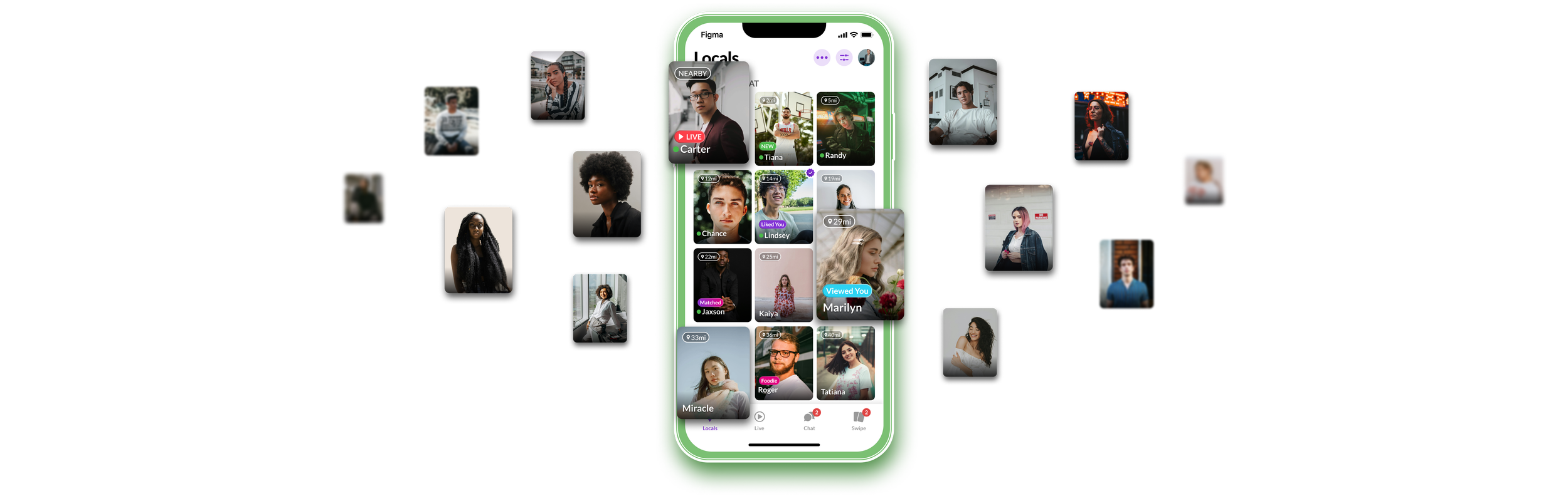
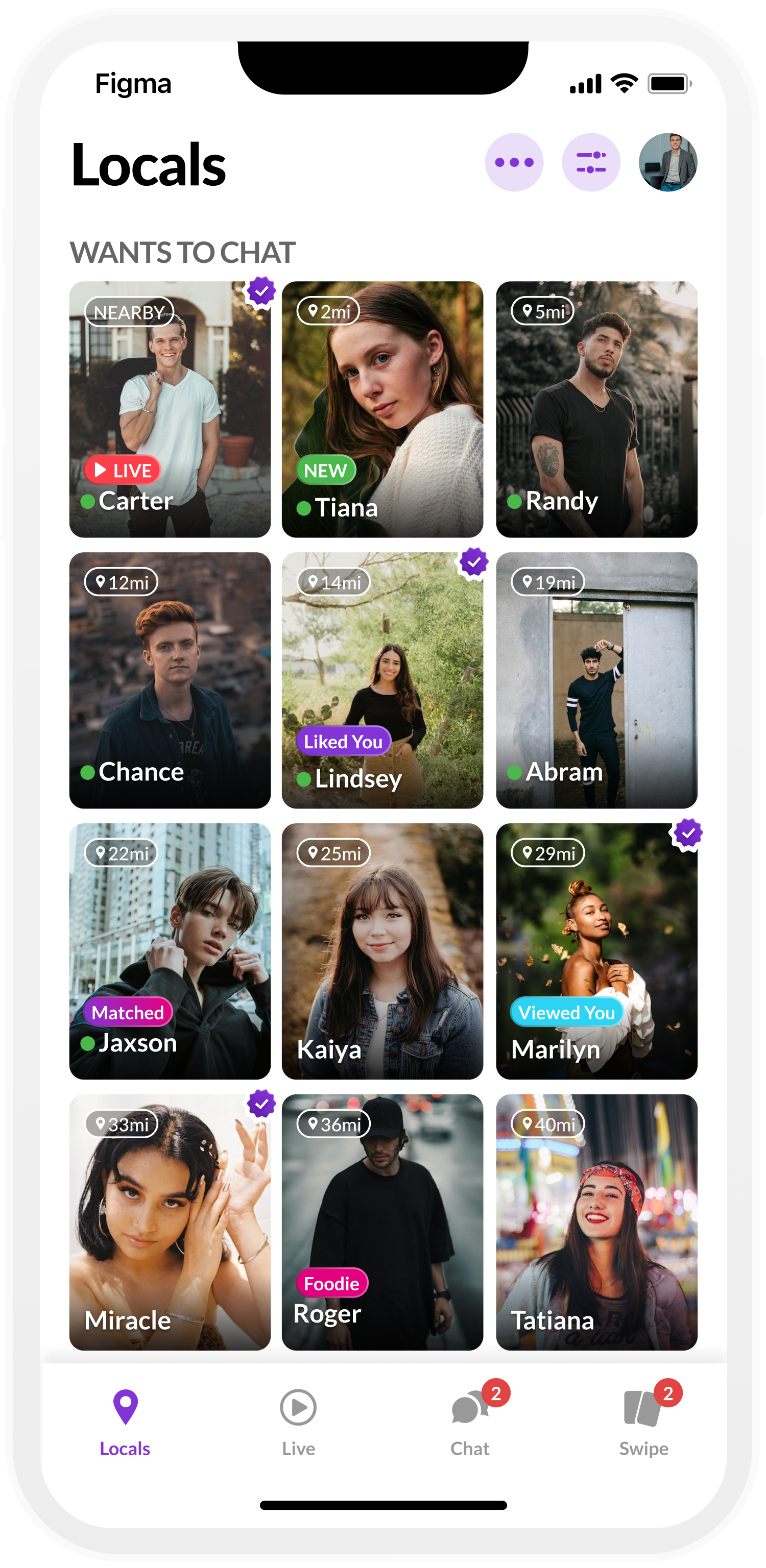
Grid
To begin improving our Locals grid, I updated our round user profiles to a portrait style. This greatly minimizes the empty space on the grid and allows more of the user’s profile photo to show.
The larger portrait style cells allow me to add any necessary information within the cell as opposed to the previous state where the information was hanging out side of the profile photo, giving a disjointed experience.
I kept the name, live streaming status, online status, and verification status. I then created to new pills to highlight any relevance to the viewing user. These new pills are New, Matched, Liked You, Viewed You, distance, and pills emphasizing common interests.

Grid - Base layout

Generic Live Streaming Preview
Grid - Expanded
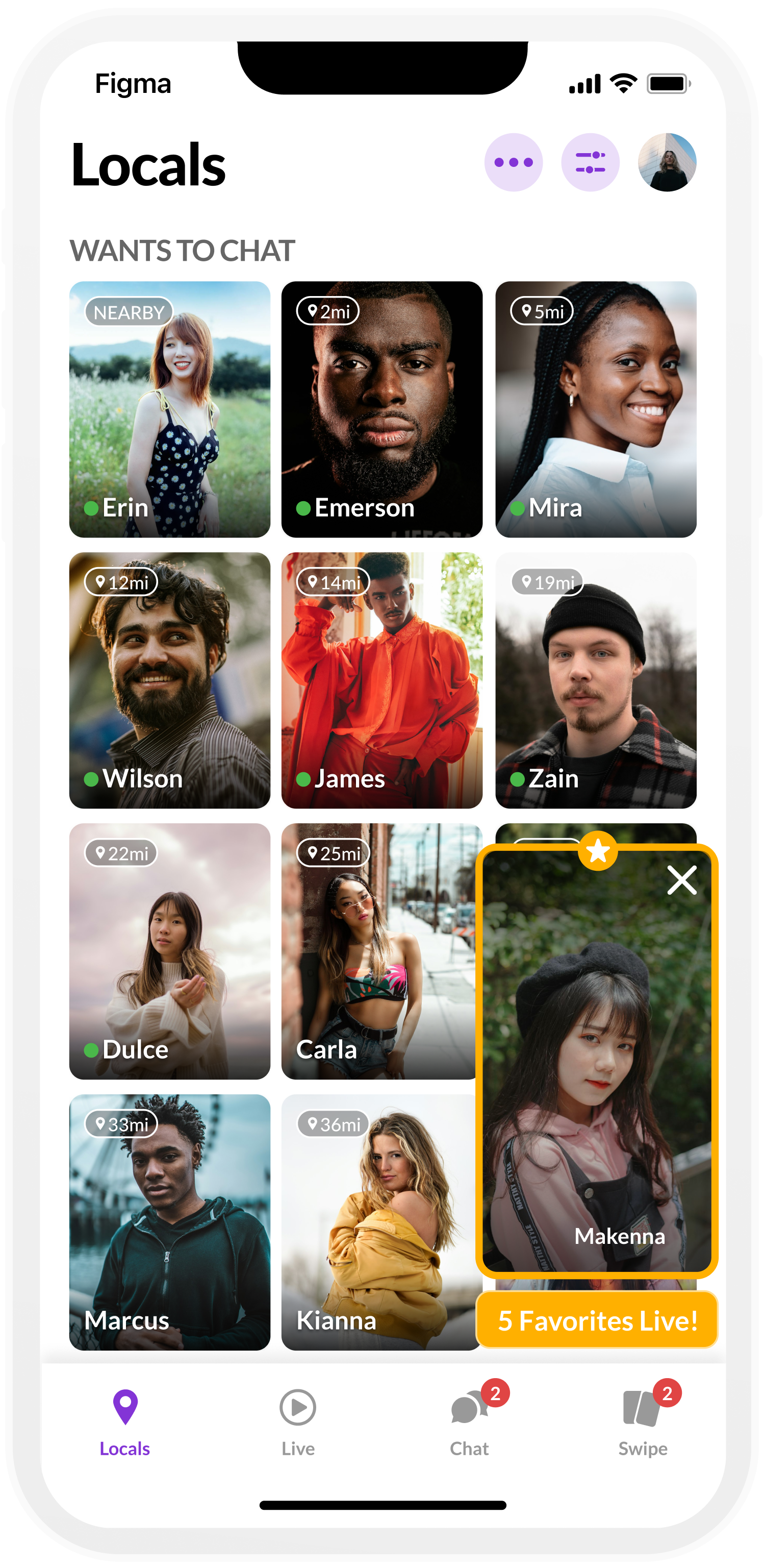
Unique Live Streaming Preview
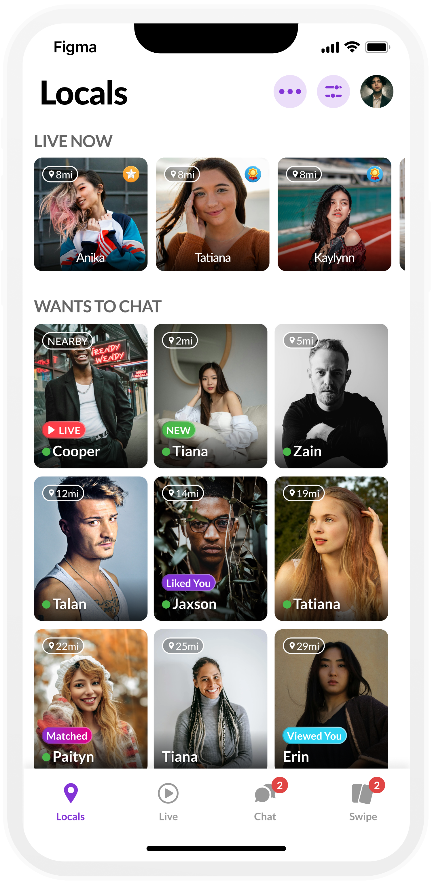
Grid with Live Marquee

Exhausted Results
Preferences
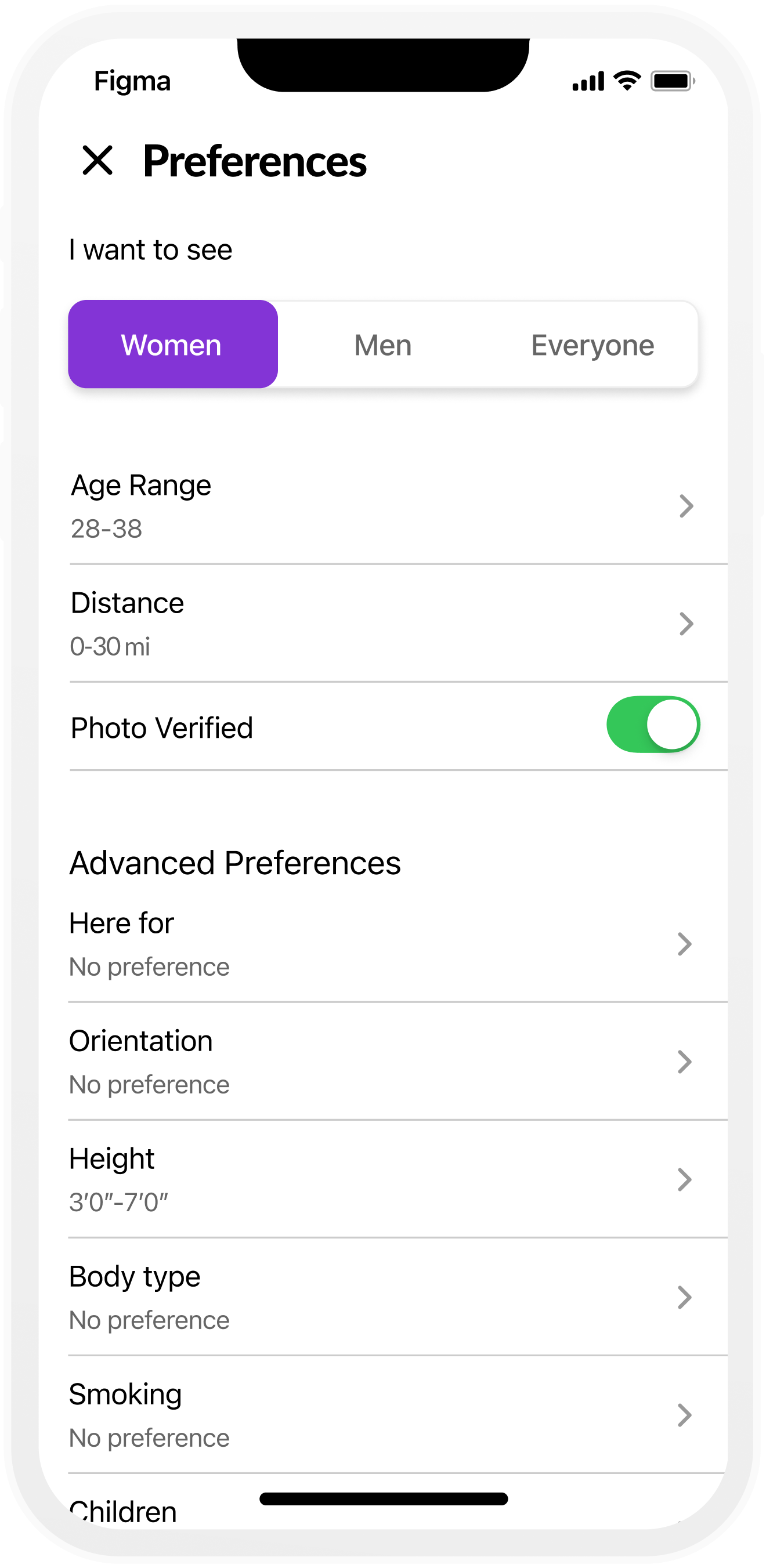
After several discussions with the product team, we rearranged, removed, and added several new preferences options. The preferences a user is able to adjust without a Pro account are Gender, Age Range, Distance, and Photo Verification. Advanced Filters are locked behind a paywall to incentivize users to subscribe to the app with a pro membership. These Advanced Filters are Here for, Orientation, Height, Body Type, Smoking, Children, Education, Religion, and Ethnicity. Lastly I converted the filters to drawers rather than taking the user to a new page. This helps make the preference setting experience feel more seamless with less jumping around. I also added a “See other people if I run out” checkbox to the preferences if the search results are becoming exhausted.
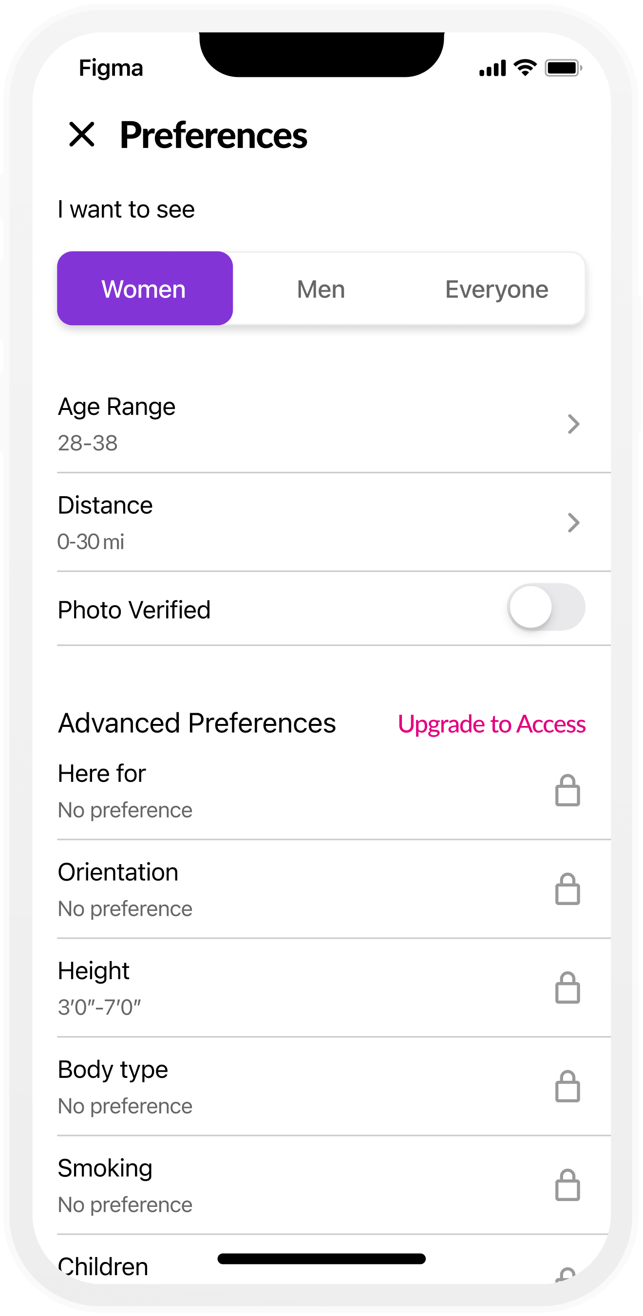
Locked Advanced Preferences

Here For
Unlocked Advanced Filters

Orientation

Children
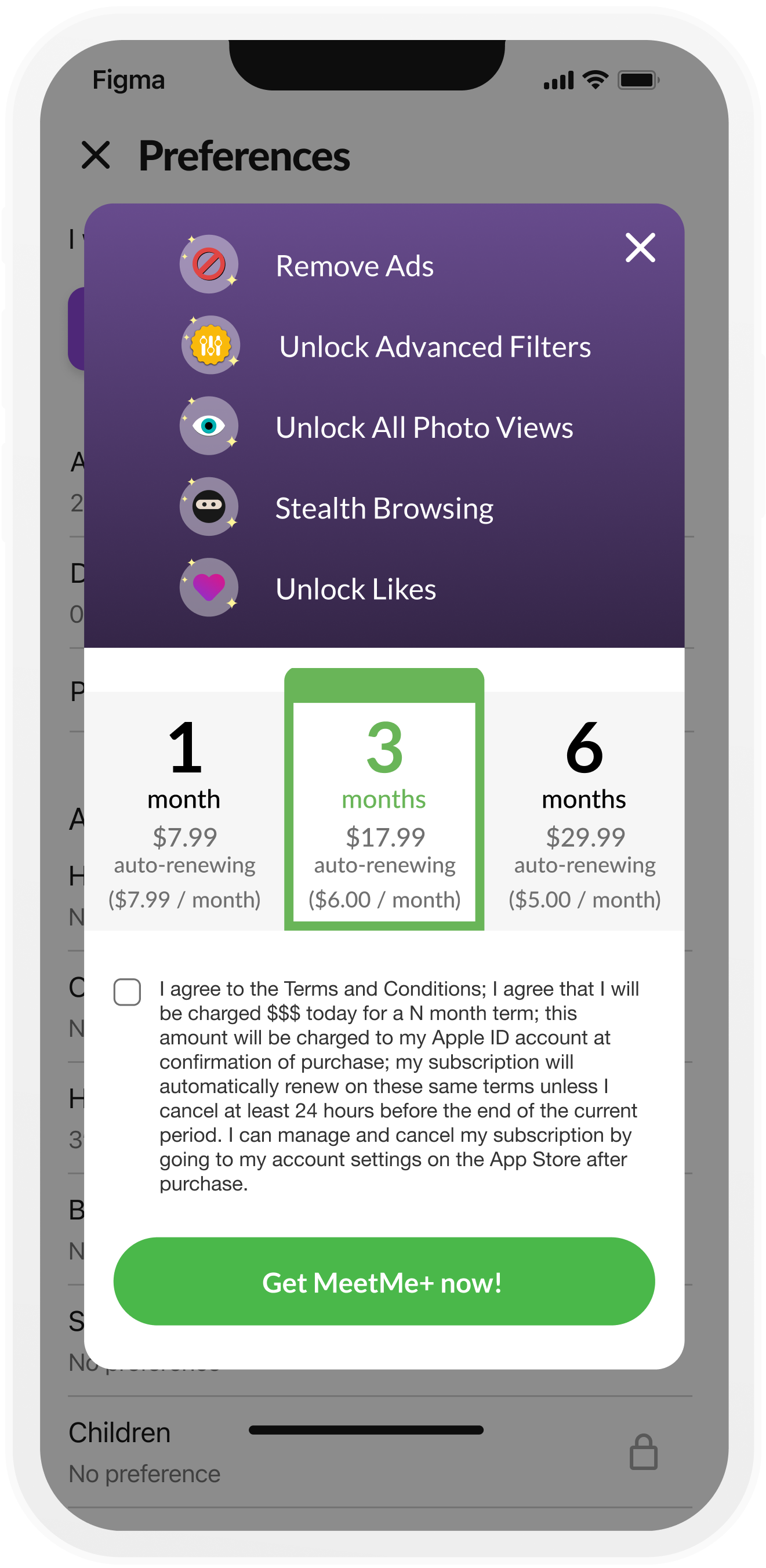
Upgrade to Pro

Height
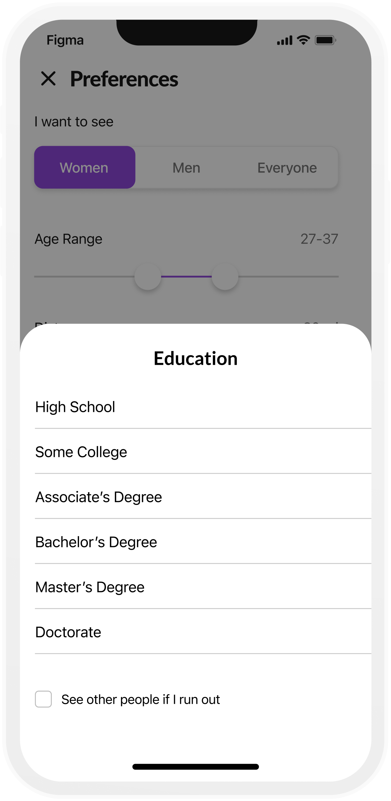
Education

Age Range

Body Type

Religion

Distance

Smoking

Ethnicity